# css盒模型
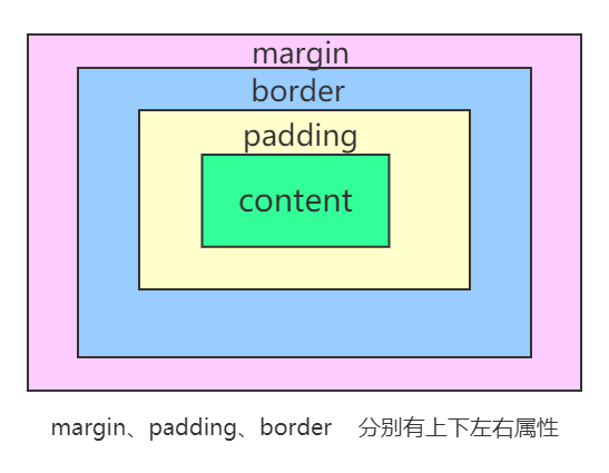
# 外边距 margin
# 声明定义
边距顺序依次为:上、右、下、左。
         /*上、 右、下、 左*/
   margin:10px 20px 30px 40px;
        /*上下、 左右*/
   margin:20px   30px;
        /* 上   左右    下*/
   margin:20px  30px  10px;

   /*外边距全部定义为 10px*/
   margin:10px
# 边距合并
相邻元素的纵向外边距会进行合并
# 内边距
内边距使用 padding 进行定义,使用语法与 margin 相似。不存在负的内边距
# BOX-SIZING
宽度与高度包括内边距与边框。
box-sizing 属性值
- content-box 默认值,标准盒子模型
比如说 .box {width: 350px; border: 10px solid black;}
在浏览器中的渲染的实际宽度将是 370px。
- border-box
width 和 height 属性包括内容,内边距和边框,但不包括外边距。
width = border + padding + 内容的宽度
height = border + padding + 内容的高度
# 边框 border
# 样式选择
| 类型 | 描述 |
|---|---|
| none | 定义无边框。 |
| dotted | 定义点状边框。在大多数浏览器中呈现为实线。 |
| dashed | 定义虚线。在大多数浏览器中呈现为实线。 |
| solid | 定义实线。 |
| double | 定义双线。双线的宽度等于 border-width 的值。 |
| groove | 定义 3D 凹槽边框。其效果取决于 border-color 的值。 |
| ridge | 定义 3D 垄状边框。其效果取决于 border-color 的值。 |
| inset | 定义 3D inset 边框。其效果取决于 border-color 的值。 |
| outset | 定义 3D outset 边框。其效果取决于 border-color 的值。 |
一次定义四个边
p{
    border-style:double
    /*双实线*/
}
样式顺序为上、右、下、左,可以分别进行定义 同padding/margin
h2 {
	border-style: outset solid dotted double;
	border-width: 8px;
}
单独设置一边样式
| 规则 | 说明 |
|---|---|
| border-top-style | 顶边 |
| border-right-style | 右边 |
| border-bottom-style | 下边 |
| border-left-style | 左边 |
| border-style | 四边 |
# 边框宽度
| 规则 | 说明 |
|---|---|
| border-top-width | 顶边 |
| border-right-width | 右边 |
| border-bottom-width | 下边 |
| border-left-width | 左边 |
| border-width | 四边 |
# 边框颜色
| 规则 | 说明 |
|---|---|
| border-top-color | 顶边 |
| border-right-color | 右边 |
| border-bottom-color | 下边 |
| border-left-color | 左边 |
# 简写
| 规则 | 说明 |
|---|---|
| border-top | 顶边 |
| border-right | 右边 |
| border-bottom | 下边 |
| border-left | 左边 |
| border | 四边 |
| border-color | 四边 |
p{
    border-bottom:1px solid red;
}
# 行内元素边框
行内元素也可以设置边框
span {
	border-bottom: solid 2px red;
}
# 圆角边框
使用 border-radius 规则设置圆角,可以使用px | % 等单位。也支持四个边分别设置。
| 选项 | 说明 |
|---|---|
| border-top-left-radius | 上左 |
| border-top-right-radius | 上右 |
| border-bottom-left-radius | 下左 |
| border-bottom-right-radius | 下右 |
也可以像padding / margin 使用简写
div{
    border-radius:5px 10px
    /* 【左上,右下】5px
       【右上,左下]10px
     */

    border-radius:5px 8px 10px ;
    /*  【左上】5px
        【左下,右上】8px
        【右下】 10px
    */

    border-radius: 10px  30px  50px  100px;
    /* 方向顺时针  左上  右上  右下  左下*/
}
# 轮廓线
元素在获取焦点时产生,并且轮廓线不占用空间。可以使用伪类 :focus 定义样式。
- 轮廓线显示在边框外面
- 轮廓线不影响页面布局
# 轮廓线样式
| 类型 | 描述 |
|---|---|
| none | 定义无边框。 |
| dotted | 定义点状边框。在大多数浏览器中呈现为实线。 |
| dashed | 定义虚线。在大多数浏览器中呈现为实线。 |
| solid | 定义实线。 |
| double | 定义双线。双线的宽度等于 border-width 的值。 |
| groove | 定义 3D 凹槽边框。其效果取决于 border-color 的值。 |
| ridge | 定义 3D 垄状边框。其效果取决于 border-color 的值。 |
| inset | 定义 3D inset 边框。其效果取决于 border-color 的值。 |
| outset | 定义 3D outset 边框。其效果取决于 border-color 的值。 |
div{
    outline-style: double;
}
# 轮廓线宽设置
div{
    outline-width: 10px;
}
# 轮廓线颜色
div{
    outline-color: red;
}
# 组合定义
div{
    outline: red solid 2px;
}
# 表单轮廓线
表单默认具有轮廓线,但有时并不好看,使用以下样式规则去除。
input:focus {
	outline: none;
}
# 元素Display属性
使用 display 控制元素的显示机制。
| 选项 | 说明 |
|---|---|
| none | 隐藏元素 |
| block | 显示为块元素 |
| inline | 显示为行元素,不能设置宽/高 |
| inline-block | 行级块元素,允许设置宽/高 |
使用该属性可以将块级元素与非块级元素相互转换,使其有对应的特性
# VISIBILITY
控制元素的显示隐藏,在隐藏后空间会保留。
<style>
	article {
    padding: 30px;
    border: solid 2px red;
    width: 200px;
  }
  article div {
    width: 100px;
    height: 100px;
    border: solid 2px red;
    padding: 20px;
  }
  article div:nth-of-type(1) {
    visibility: hidden;
  }
</style>
<article>
	<div></div>
	<div></div>
</article>
# 溢出控制
# 隐藏控制
| 选项 | 说明 |
|---|---|
| hidden | 溢出内容隐藏 |
| scroll | 显示滚动条(有些浏览器会一直显示,有些在滚动时显示) |
| auto | 根据内容自动处理滚动条 |
溢出隐藏
div {
  width: 400px;
  height: 100px;
  border: solid 2px #ddd;
  padding: 20px;
  overflow: hidden;
}
溢出产生滚动条
不同浏览器处理方式不同,有些直接显示出来,有些在滚动时才显示。
div {
  width: 400px;
  height: 100px;
  border: solid 2px #ddd;
  padding: 20px;
  overflow: scroll;
/*overflow-y: scroll;  设置y轴滚动条*/
/*overflow-x: scroll;  设置x轴滚动条*/
}
# 文本溢出
单行文本溢出
提示
必须满足三个条件
- 1、先强制一行显示
white-space: nowrap;
- 2、超出部分隐藏
overflow: hidden;
- 3、超出部分使用省略号
text-overflow: ellipsis;
div {
  width: 400px;
  height: 100px;
  border: solid 2px #ddd;
  padding: 20px;
  overflow: hidden;
  text-overflow: ellipsis;
  white-space: nowrap;
}
多行文本溢出控制
WARNING
多行文本溢出控制,有较大的兼容性问题,适合webkit浏览器或移动端(移动端大部分是webkit内核)
建议后端控制显示字数
div {
  width: 200px;
  overflow: hidden;
  text-overflow: ellipsis;
  display: -webkit-box;
  /* 限制一个块元素内显示文本行数 */
  -webkit-line-clamp: 3;
  /* 设置或检索伸缩盒子的子元素排列方式 */
  -webkit-box-orient: vertical;
}
# 尺寸定义
可以使用多种方式为元素设置宽、高尺寸。
| 选项 | 说明 |
|---|---|
| width | 宽度 |
| height | 高度 |
| min-width | 最小宽度 |
| min-height | 最小高度 |
| max-width | 最大宽度 |
| max-height | 最大高度 |
| fill-available | 撑满可用的空间 |
| fit-content | 根据内容适应尺寸 |
# min&max
不希望图片太大造成溢出窗口,也不希望太小影响美观,使用以下代码可以做到约束。
<style>
	div {
    width: 400px;
    border: solid 2px #ddd;
    padding: 20px;
  }
  div img {
    min-width: 50%;
    max-width: 90%;
  }
</style>
# fill-available
行块元素可以撑满可用空间
<p class="available">The Mozilla community produces a lot of great software.</p>
p.available {
    background: lightblue;
    width: -webkit-fill-available;
    text-align: center;
    margin: auto;
}
# fit-content
根据内容自动适应宽度
<p class="fit-content">The Mozilla community produces a lot of great software.</p>
p.fit-content {
    background: lightblue;
    width: -webkit-fill-available;
    text-align: center;
    margin: auto;
}
# min-content
<p class="minblue">The Mozilla community produces a lot of great software.</p>
p.minblue {
  background: lightblue;
  width: -moz-min-content;    /* Firefox */
  width: -webkit-min-content; /* Chrome */
}
# max-content
<p class="maxgreen">The Mozilla community produces a lot of great software.</p>
p.maxgreen {
  background: lightgreen;
  width: intrinsic;           /* Safari/WebKit 使用了非标准的名称 */
  width: -moz-max-content;    /* Firefox/Gecko */
  width: -webkit-max-content; /* Chrome */
}