# Flex 弹性布局
WARNING
设为 Flex 布局以后,子元素的 float、clear 和 vertical-align 属性将失效。
# 基本概念
CSS 弹性盒子布局 是 CSS 的模块之一,定义了一种针对用户界面设计而优化的 CSS 盒子模型。在弹性布局模型中,弹性容器的子元素可以在任何方向上排布,也可以“弹性伸缩”其尺寸,既可以增加尺寸以填满未使用的空间,也可以收缩尺寸以避免父元素溢出。子元素的水平对齐和垂直对齐都能很方便的进行操控。通过嵌套这些框(水平框在垂直框内,或垂直框在水平框内)可以在两个维度上构建布局。
采用 Flex 布局的元素,称为 Flex 容器(flex container),简称"容器"。它的所有子元素自动成为容器成员,称为 Flex 项目(flex item),简称"项目"。
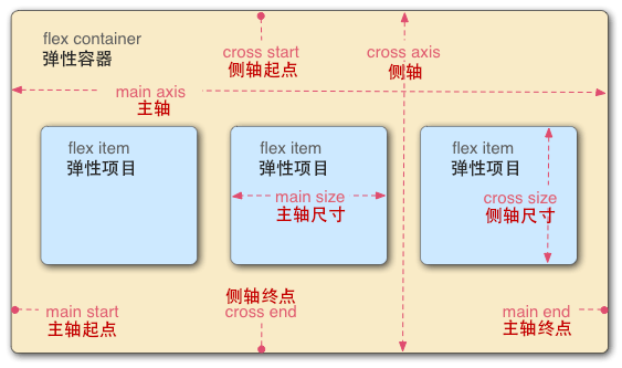
如上图:容器默认存在两根轴:水平的主轴(main axis)和垂直的交叉轴(cross axis)。主轴的开始位置(与边框的交叉点)叫做main start,结束位置叫做 main end;交叉轴的开始位置叫做 cross start,结束位置叫做cross end。
项目默认沿主轴排列。单个项目占据的主轴空间叫做 main size,占据的交叉轴空间叫做 cross size。
# 弹性盒子(容器)
# 声明定义
使用 display:flex 或 display:inline-flex 声明为弹性盒子。
以下 6 个属性设置在容器上。
# flex-direction
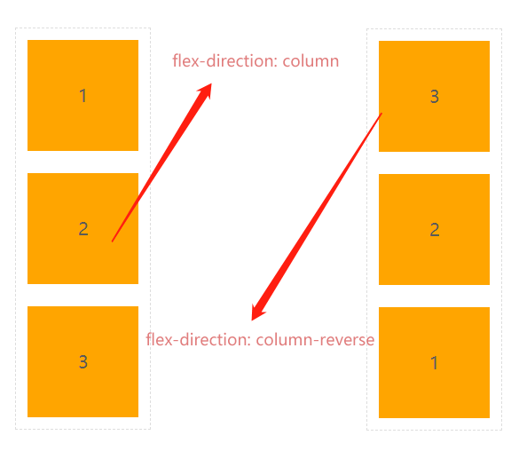
flex-direction属性决定主轴的方向 (即项目的排列方向)
| 值 | 描述 |
|---|---|
| row | 从左到右水平排列元素(默认值) |
| row-reverse | 从右向左排列元素 |
| column | 从上到下垂直排列元素 |
| column-reverse | 从下到上垂直排列元素 |
<section>
  <div>1</div>
  <div>2</div>
  <div>3</div>
</section>
section {
  width: 600px;
  border: 1px dashed #ddd;
  margin: 0 auto;
  display: flex;
  /*默认值可省略*/
  flex-direction: row-reverse;
}
section div {
  width: 100px;
  height: 100px;
  margin: 10px;
  color: #5a5a5a;
  text-align: center;
  line-height: 100px;
  background: orange;
}

section {
  display: flex;
  flex-direction: row-reverse;
}

section {
  display: flex;
  flex-direction: column;
  /*flex-direction: column-reverse;  */
}
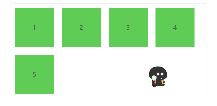
# flex-wrap
默认情况下,项目都排在一条线(又称"轴线")上。flex-wrap 属性定义,如果一条轴线排不下,如何换行。
| 选项 | 说明 |
|---|---|
| nowrap | 元素不拆行或不拆列(默认值) |
| wrap | 容器元素在必要的时候拆行或拆列。 |
| wrap-reverse | 容器元素在必要的时候拆行或拆列,但是以相反的顺序 |
<section>
  <div>1</div>
  <div>2</div>
  <div>3</div>
  <div>4</div>
  <div>5</div>
</section>
section {
  width: 500px;
  border: 1px dashed #ddd;
  margin: 0 auto;
  display: flex;
}

section div {
  width: 100px;
  height: 100px;
  margin: 10px;
  color: #5a5a5a;
  text-align: center;
  line-height: 100px;
  background: rgb(95, 204, 85);
}
- nowrap
section {
  flex-direction: row;
  flex-wrap: nowrap;
}

- wrap
section {
  flex-direction: row;
  flex-wrap: wrap;
}
- wrap-reverse
section {
  flex-direction: row;
  flex-wrap: wrap-reverse;
}
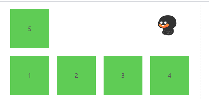
当主轴为 column 时 与上类似
# flex-flow
flex-flow 是
flex-direction与flex-wrap的组合简写模式 😋。
flex-flow: row-reverse wrap-reverse;
从右向左排列,换行向上拆分行。
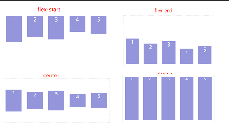
# justify-content
用于控制元素在 😛 主轴上 😛 的排列方式,主轴主轴主轴 的排列方 式。
| 选项 | 说明 |
|---|---|
| flex-start | 元素紧靠主轴起点 |
| flex-end | 元素紧靠主轴终点 |
| center | 元素从弹性容器中心开始 |
| space-between | 第一个元素靠起点,最后一个元素靠终点,余下元素平均分配空间 |
| space-around | 每个元素两侧的间隔相等。所以,项目之间的间隔比项目与边框的间隔大一倍 |
| space-evenly | 元素间距离平均分配 |
# flex-start
<section>
  <div>1</div>
  <div>2</div>
  <div>3</div>
  <div>4</div>
</section>
section {
  width: 500px;
  border: 1px dashed #ddd;
  margin: 0 auto;
  display: flex;
  justify-content: flex-start;
}

section div {
  width: 80px;
  height: 80px;
  margin: 10px;
  color: #fff;
  font-size: 20px;
  text-align: center;
  line-height: 80px;
  background: rgb(218, 97, 167);
}

# flex-end
justify-content: flex-end;

# center
justify-content: center;

# space-between
justify-content: space-between;

# space-around
justify-content: space-around;

# space-evenly
平均分配容器元素
justify-content: space-evenly;

# align-items
用于控制容器元素在 😎**`交叉轴** 🤓 上的排列方式。
- flex-start:交叉轴的起点对齐。
- flex-end:交叉轴的终点对齐。
- center:交叉轴的中点对齐。
- baseline: 项目的第一行文字的基线对齐。
- stretch(默认值):如果项目未设置高度或设为 auto,将占满整个容器的高度。
拉伸适应交叉轴
如果设置了
width | height | min-height | min-width | max-width | max-height,将影响 stretch 的结果,因为 stretch 优先级你低于宽高设置。
.box {
  align-items: flex-start | flex-end | center | baseline | stretch;
}
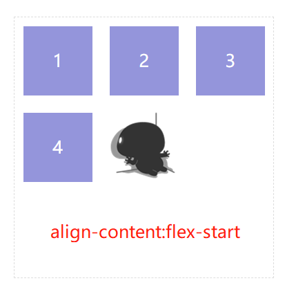
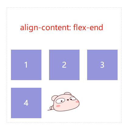
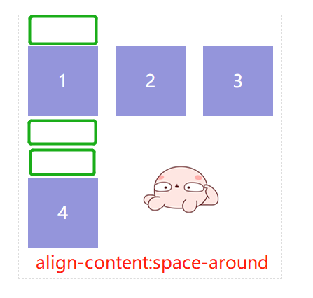
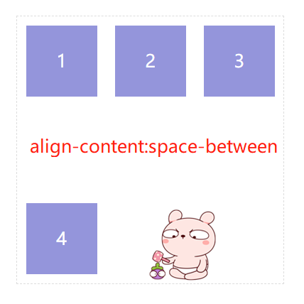
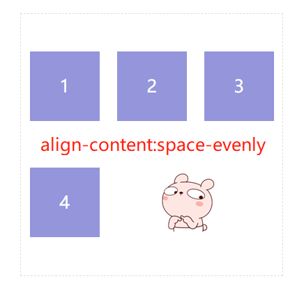
# align-content
只适用于多行显示的弹性容器,它的作用是当 flex 容器在交叉轴上有多余的空间时,对元素的对齐处理。
WARNING
该属性对单行弹性盒子模型无效。(即:带有 flex-wrap: nowrap)。
| 选项 | 说明 |
|---|---|
| stretch | 将空间平均分配给元素 |
| flex-start | 元素紧靠主轴起点 |
| flex-end | 元素紧靠主轴终点 |
| center | 元素从弹性容器中心开始 |
| space-between | 第一个元素靠起点,最后一个元素靠终点,余下元素平均分配空间 |
| space-around | 每个元素两侧的间隔相等。所以,项目之间的间隔比项目与边框的间隔大一倍 |
| space-evenly | 元素间距离平均分配 |
<section>
  <div>1</div>
  <div>2</div>
  <div>3</div>
  <div>4</div>
</section>
section {
  width: 300px;
  height: 300px;
  border: 1px dashed #ddd;
  margin: 0 auto;
  display: flex;
  flex-wrap: wrap;
}

section div {
  width: 80px;
  height: 80px;
  margin: 10px;
  color: #fff;
  font-size: 20px;
  text-align: center;
  line-height: 80px;
  background: rgb(148, 149, 219);
}
align-content: flex-start;
align-content: flex-end;
align-content: space-around;
align-content: space-between;
align-content: space-evenly;
# 弹性元素(项目)
放在弹性容器盒子中的元素即为容器元素。
WARNING
- 不能使用 float 与 clear 规则
- 弹性元素均为块元素
- 绝对定位的弹性元素不参与弹性布局